
Project Overview
Redesign an existing packaged product to be more effective.
The Process
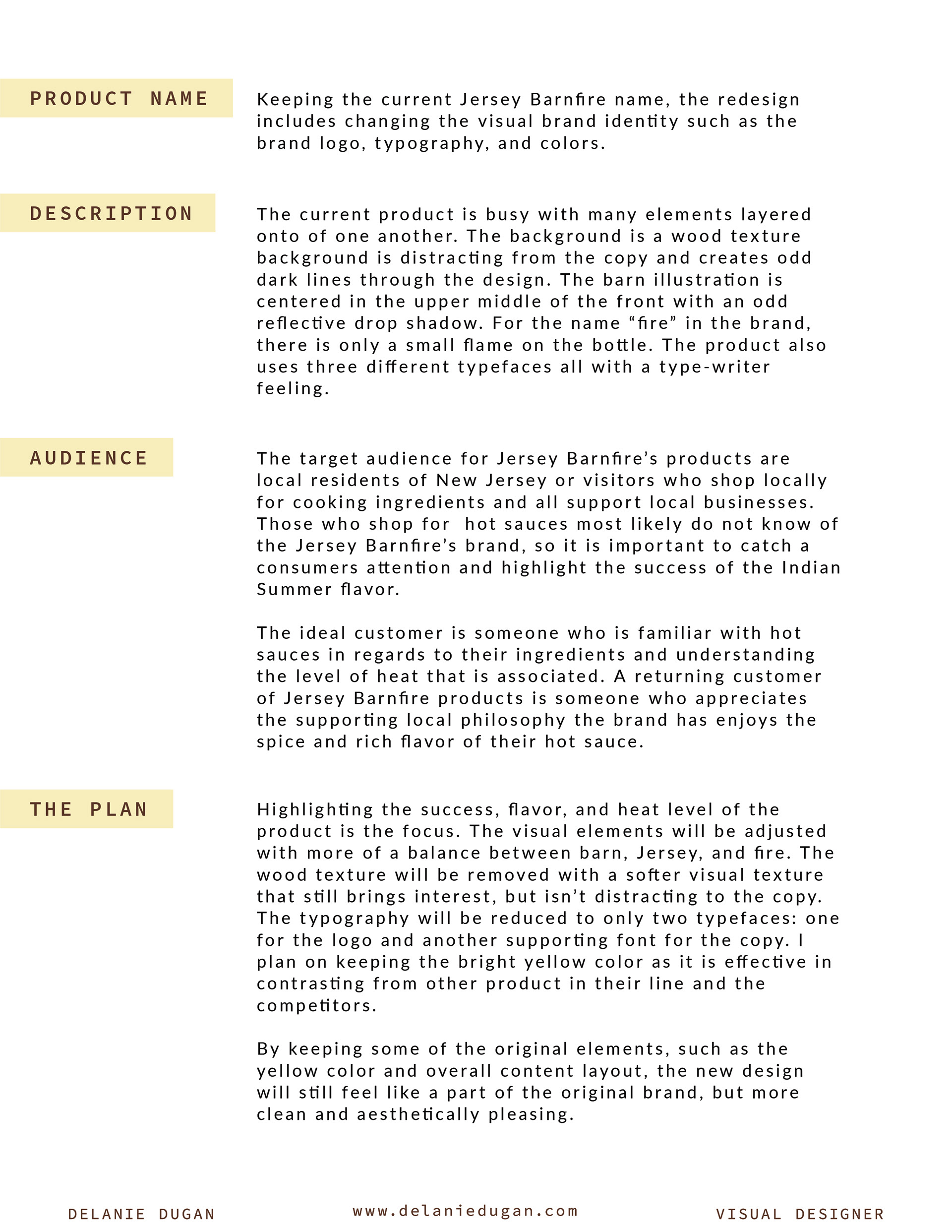
For my packaging class, my first assignment was to locate a packaged product and redesign the brand identity, visual aesthetic and package vessel as well (if needed).
The first step of the assignment was to complete a scavenger hut. Our professor tasked us with a list of items to locate such as products with a strong use of effective typography, eco conscious packaging, example of a set of products from a series and more (to see the full list with my finds and more process on this project please check out my Blogger).
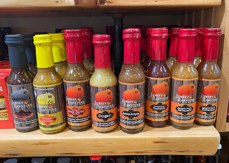
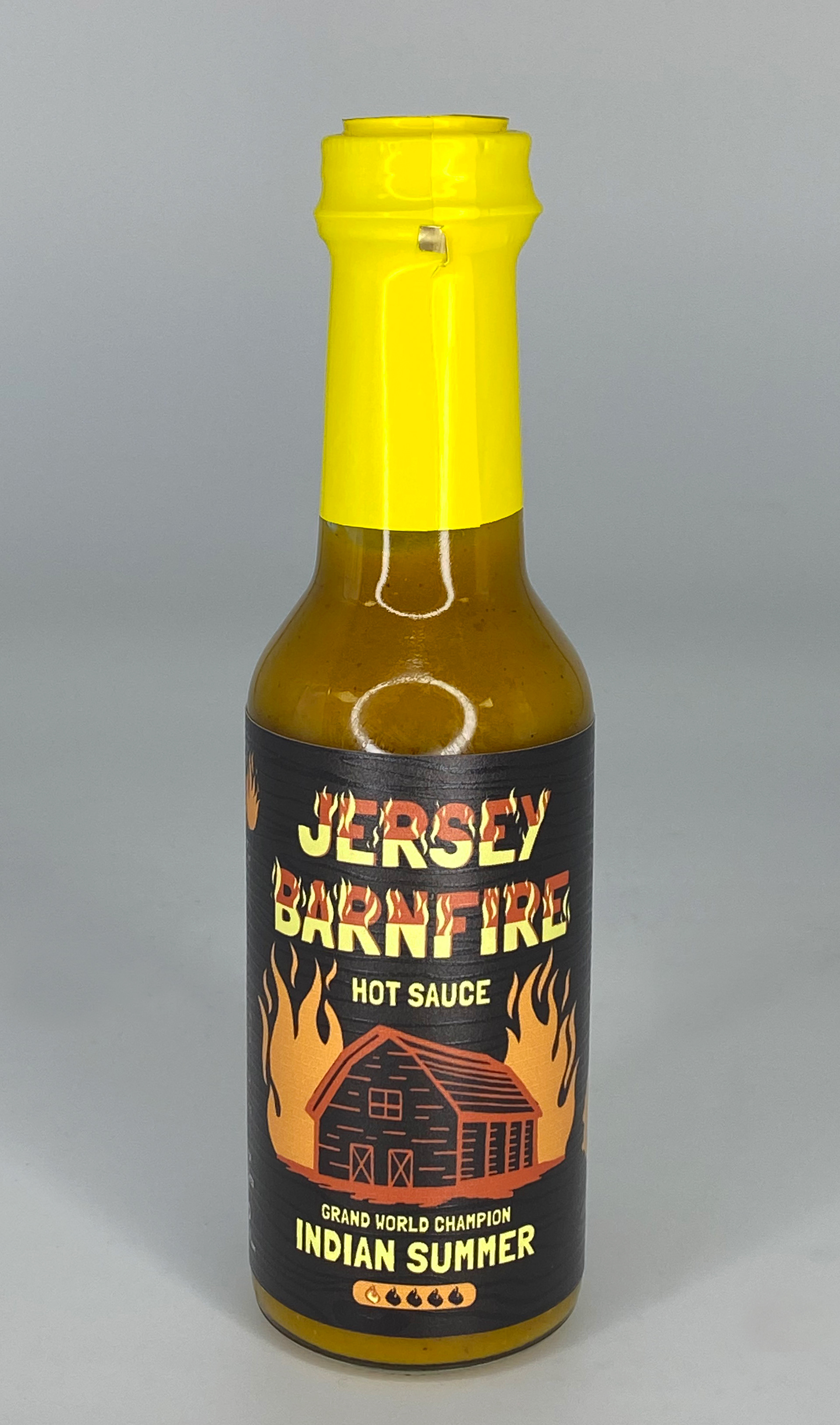
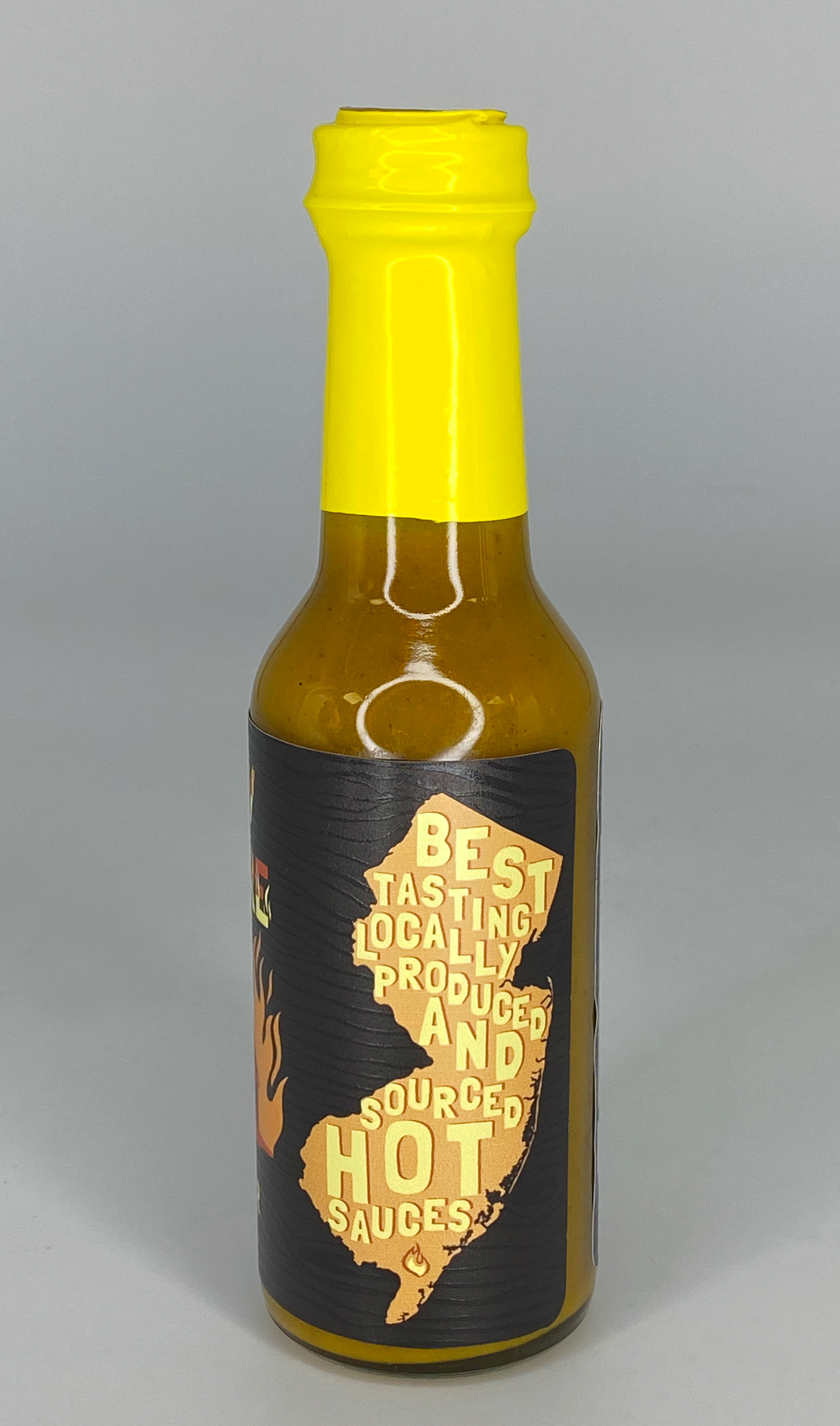
I found Jersey Barnfire hot sauces in a hot sauce store on the board walk in Ocean City, New Jersey. Their labels for their hot sauces were just layers of elements ontop of each other with 4 different typefaces and confusing logo.
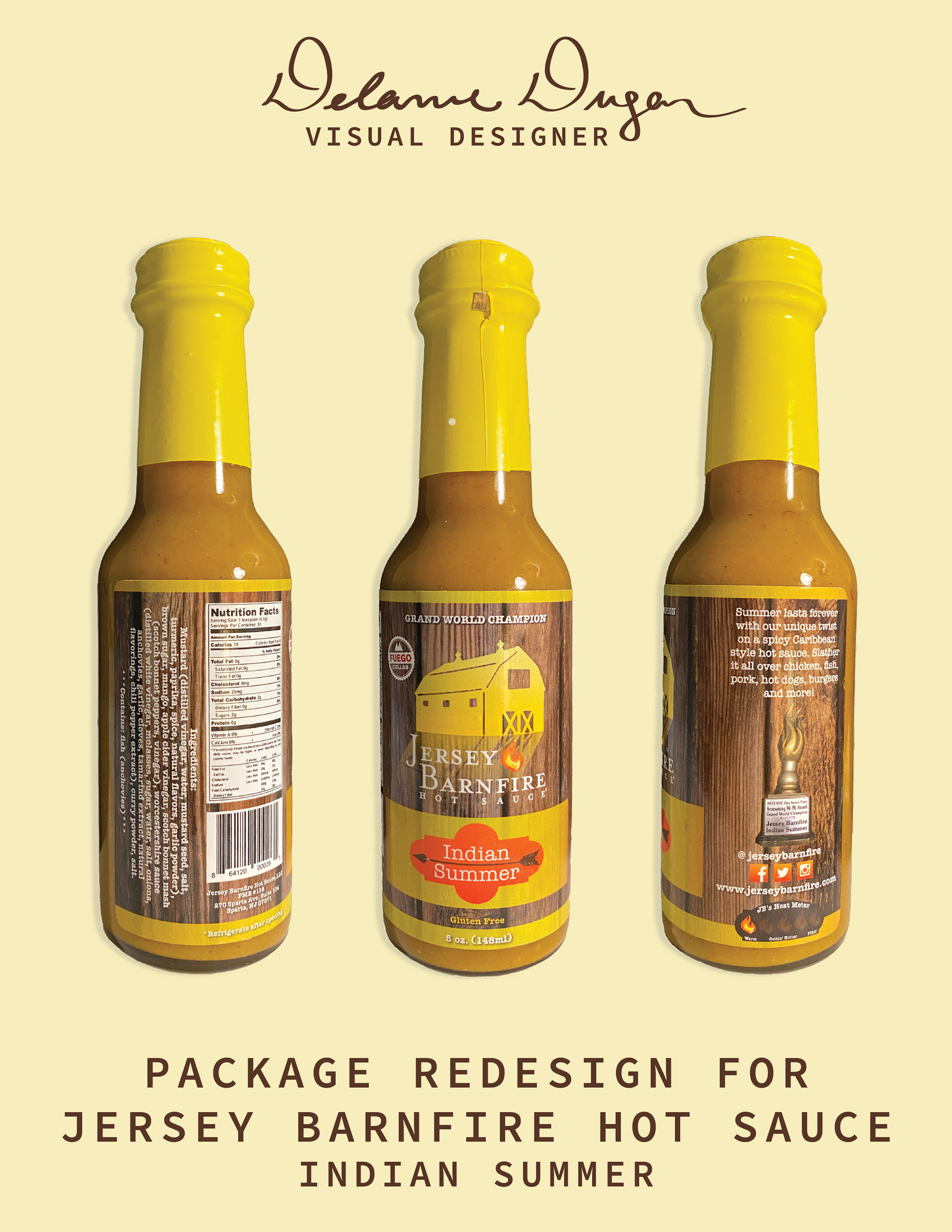
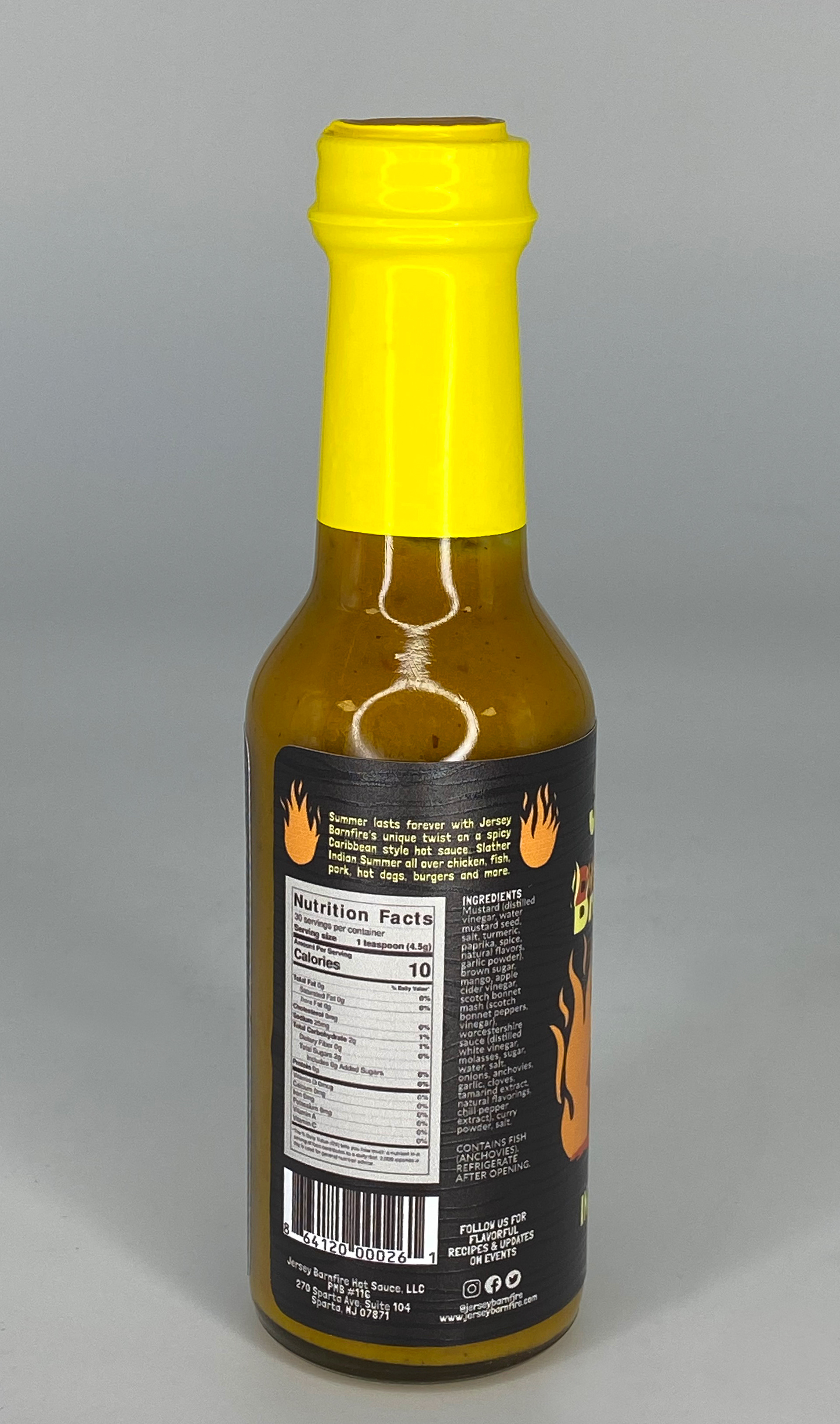
I chose the yellow bottle for my redesign not only because of it being their "grand world champion" hot sauce, but because the bright yellow caught my eye in a see of red bottles.
My next step was to write a case study tao submit to my professor for approval. As a smaller local business I didn't want to go over the top with expensive changes such as bottle shape, plastic top wrap and a different substrate. Instead I focused on how to make what they already have even better. I proposed my case study and continued onto creating.
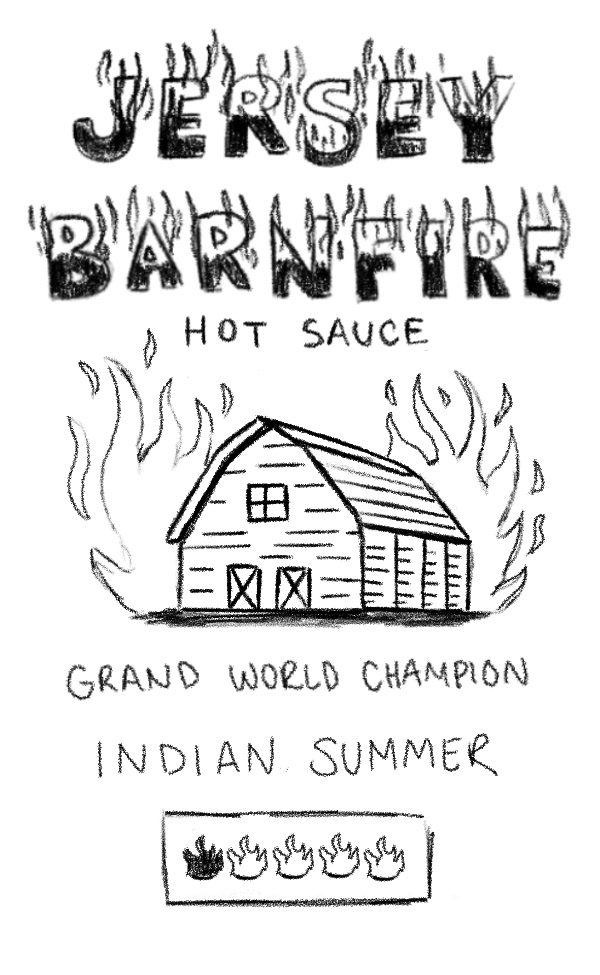
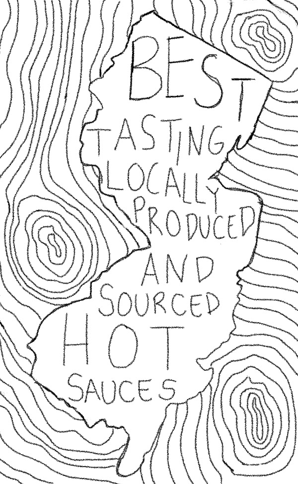
I sketched out my ideas first on paper and then moved to digital to sketch once again. I continued to emphasize the three most important elements: New Jersey, barns/wood texture, and flames. I worked on building a moodboard on Pinterest to create a direction.
I thought of illustrating the drawing elements in Adobe Fresco, but the quality was blurry even with the artboard at a big enough size. So I moved to Adobe Illustrator on the iPad and with a vector brush I worked between the iPad and desktop.
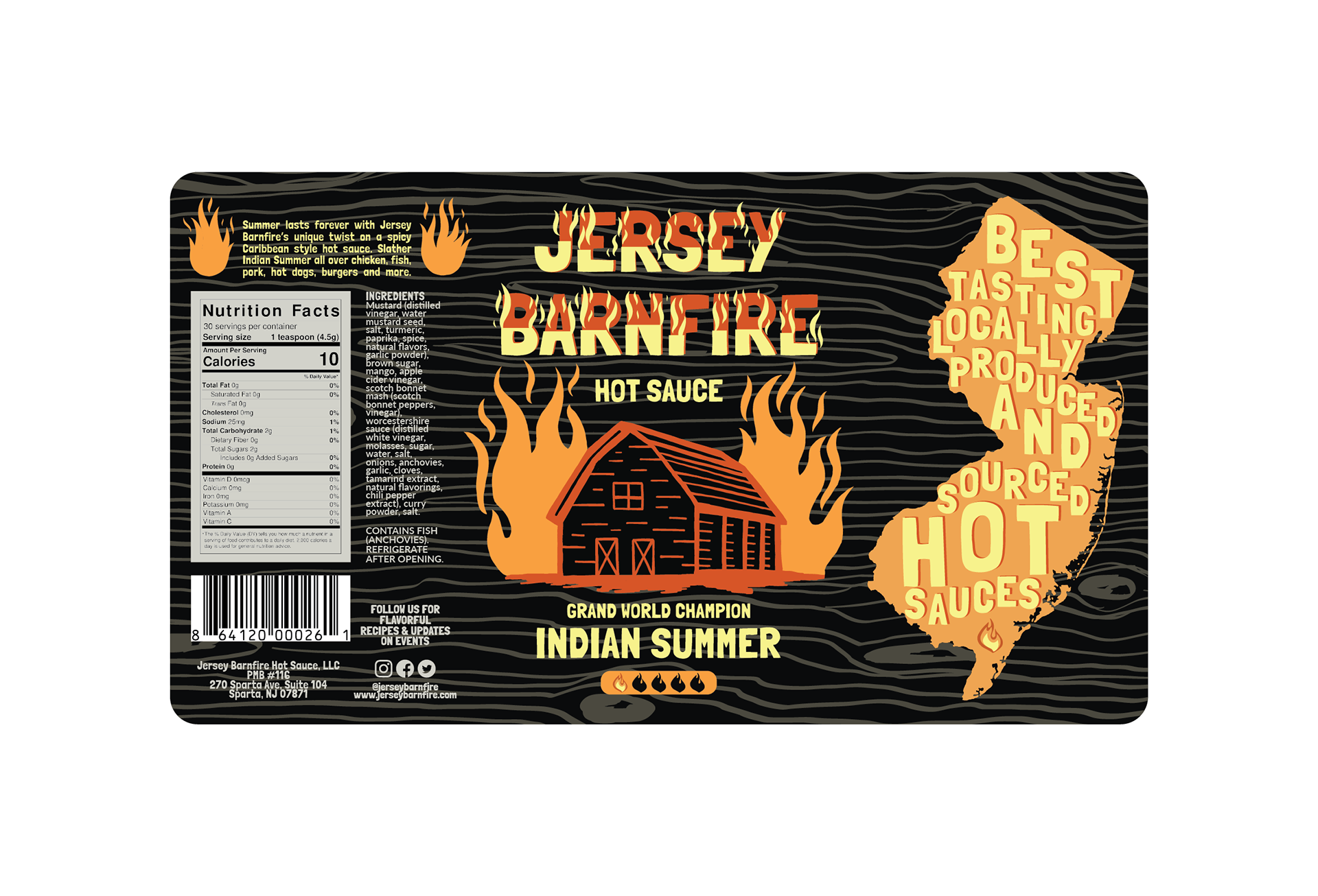
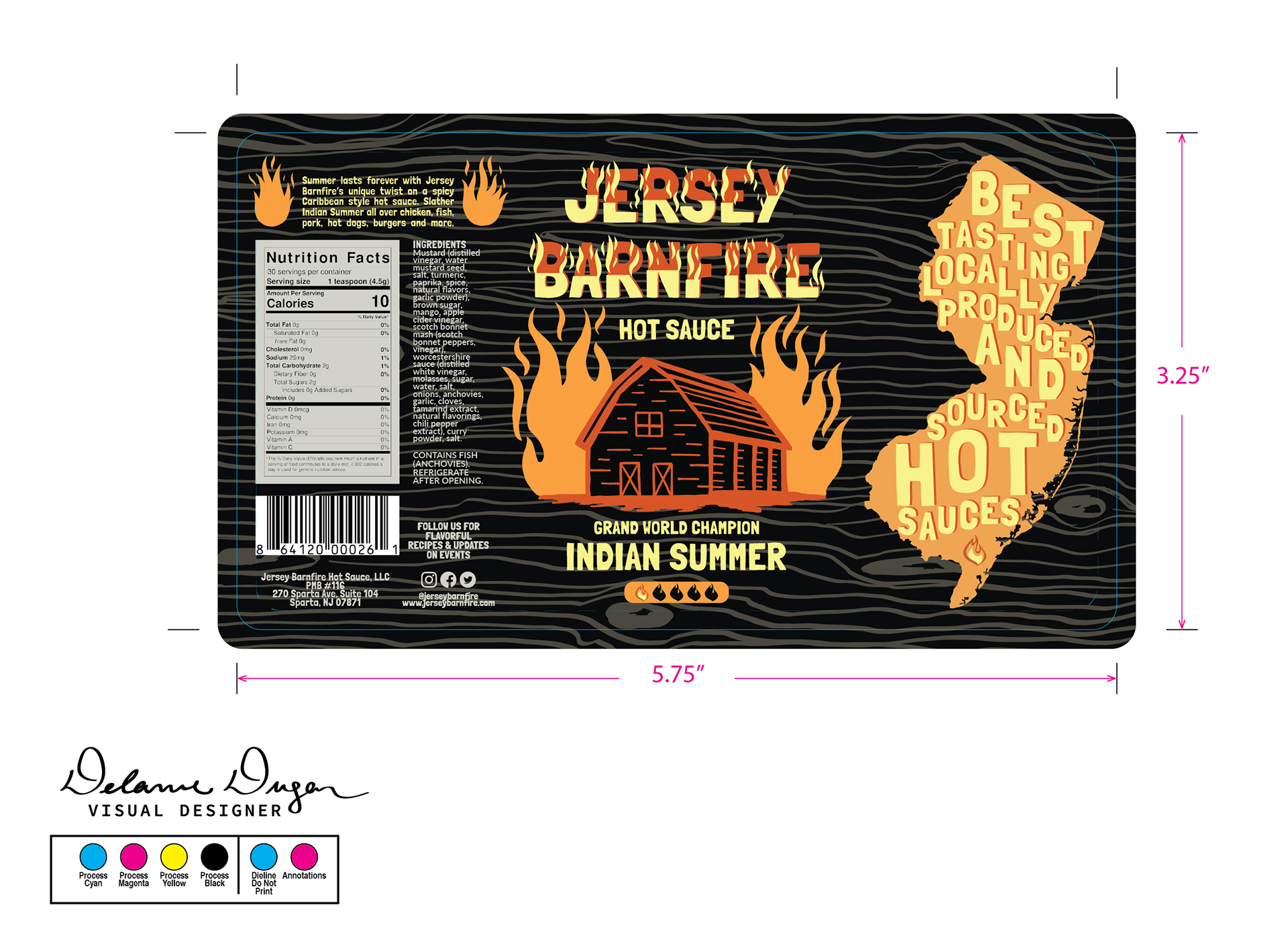
With the art completed, I set up the file to print. FORCEpkg was gracious enough to let me print out my project at their studio so I could use the uv printer and mimaki cutter. With the lead designers support I learned how to set up the printer and cutter and add special effect gloss element to the piece.
Software Used
Adobe Illustrator