
Project Overview
As part of the Google UX Design Professional Certificate program, I completed seven modules focused on designing prototypes in Figma. This included research, ideation, wireframing, prototyping, and testing.
Through three UX projects, I have developed a well-rounded skill set in design and prototyping. First, I created a complete mobile app prototype for a hypothetical local grocery store, focusing on an end-to-end process to help shoppers efficiently locate products. Next, I strengthened my Figma skills by designing a website where parents can buy and sell gently owned children's clothes and items. Lastly, I developed an app and website centered on social good, further expanding my design capabilities.
Portfolio Projects
1. Ronnie & Ollie - a mobile app for a local grocery store to help shoppers efficiently locate products.
2. Switch Hands - a website where parents can buy and sell gently owned children's clothes and items.
3. AccessColor - a mobile app and website color contrast checker focused on accessibility in design.

User Research
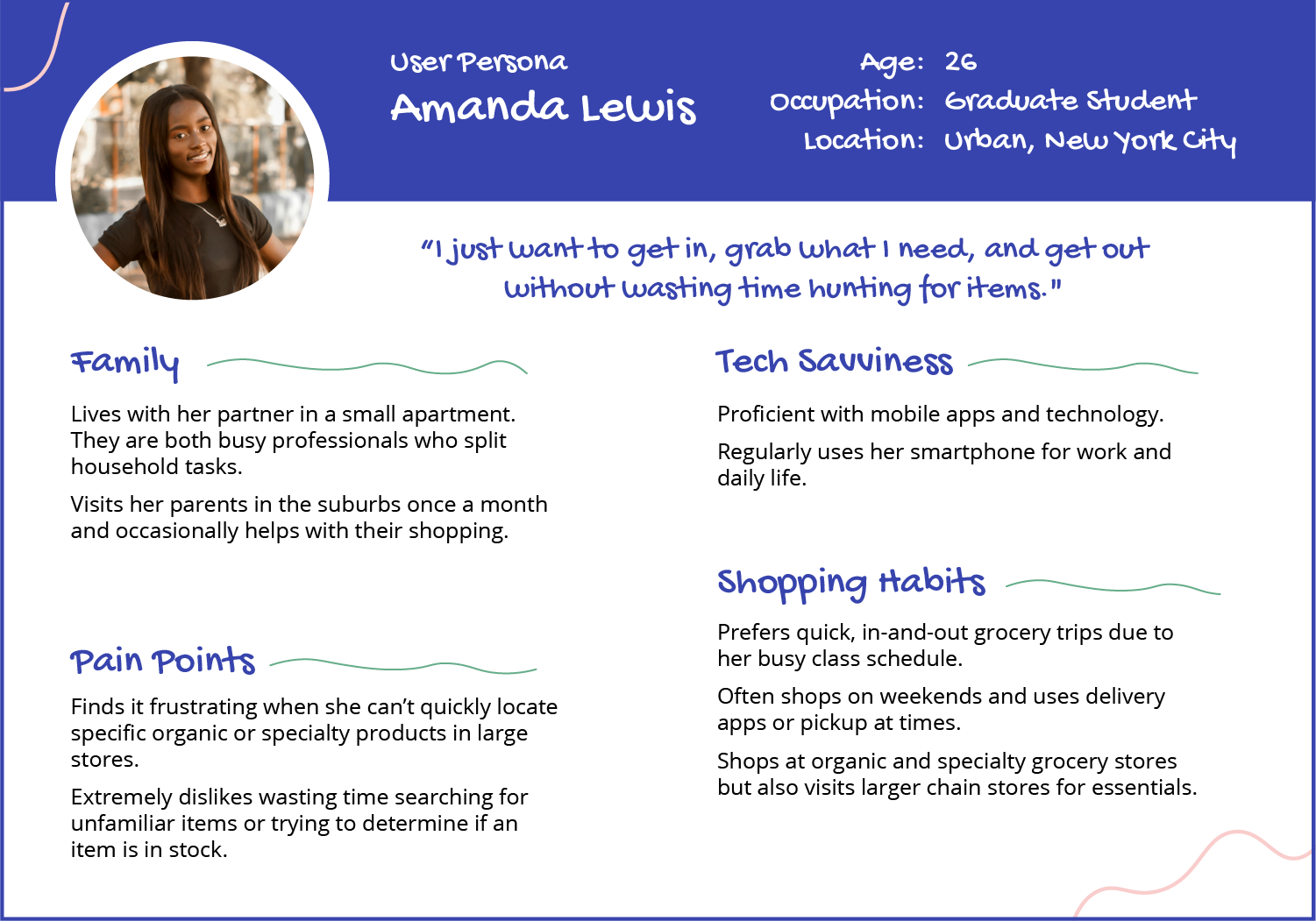
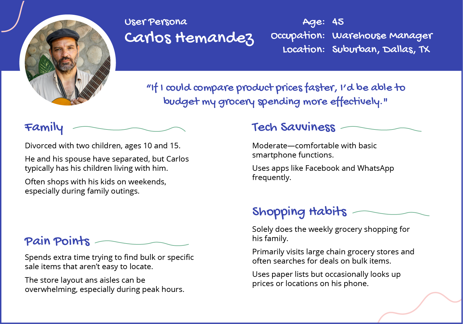
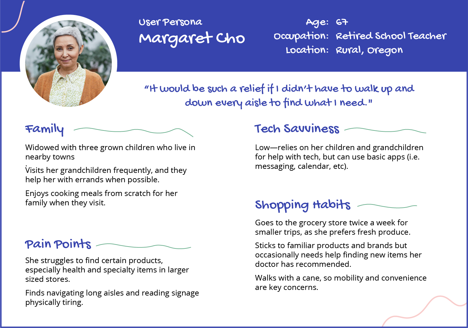
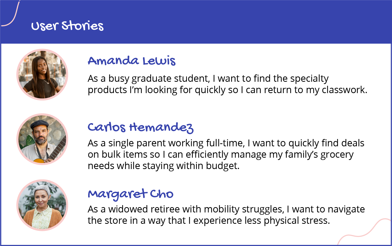
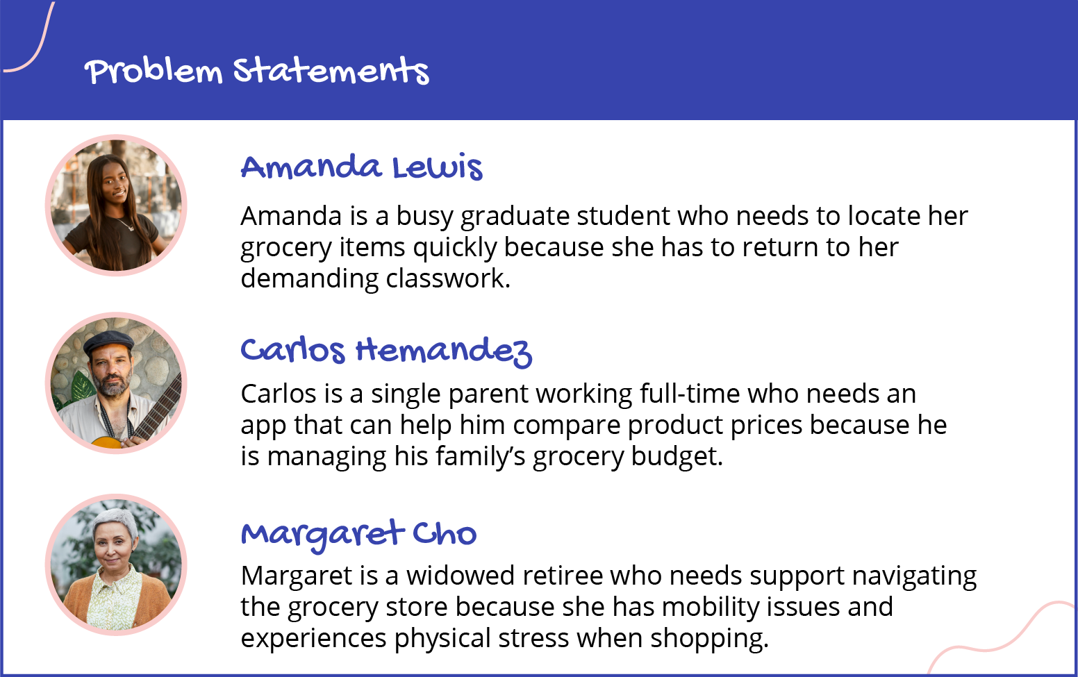
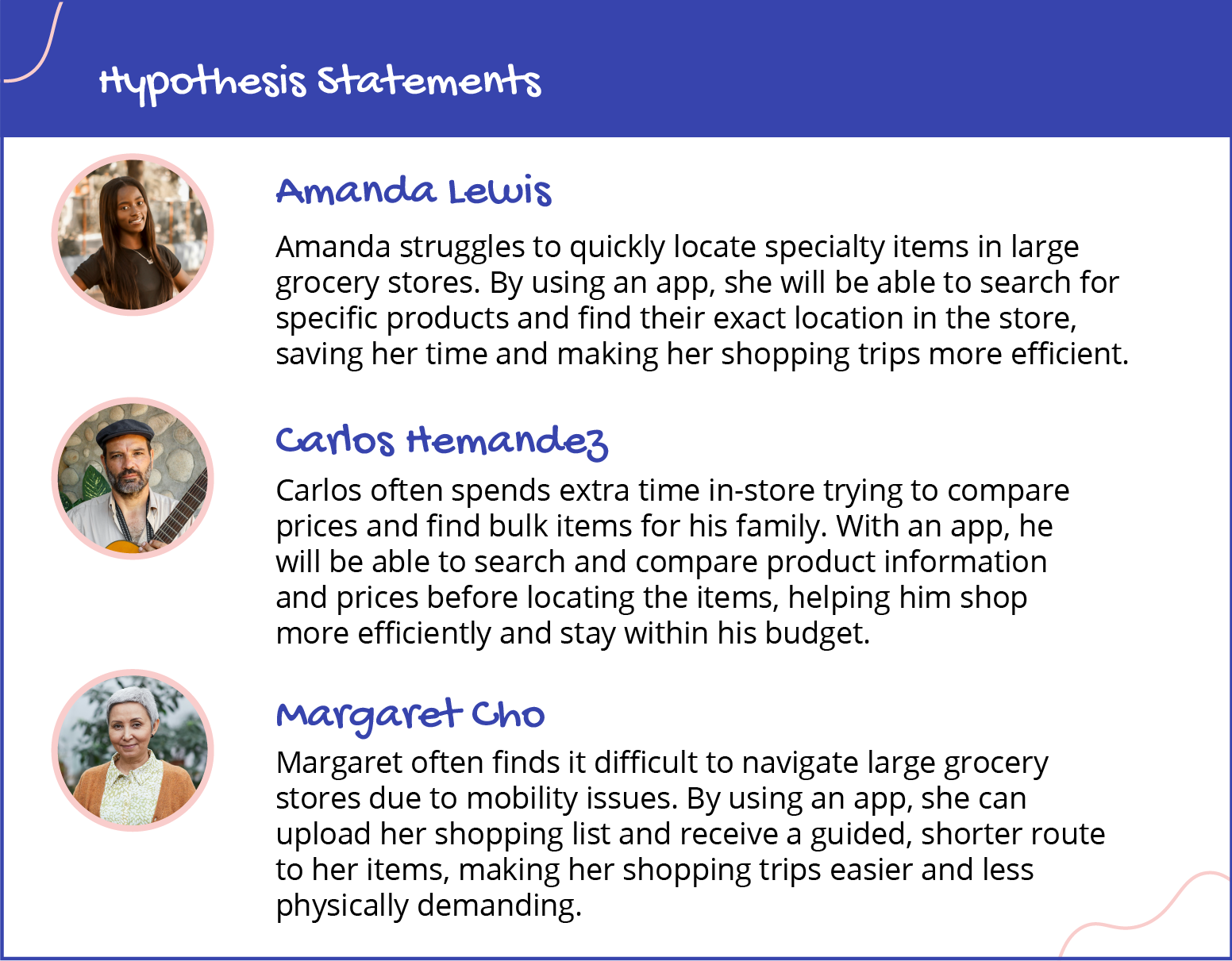
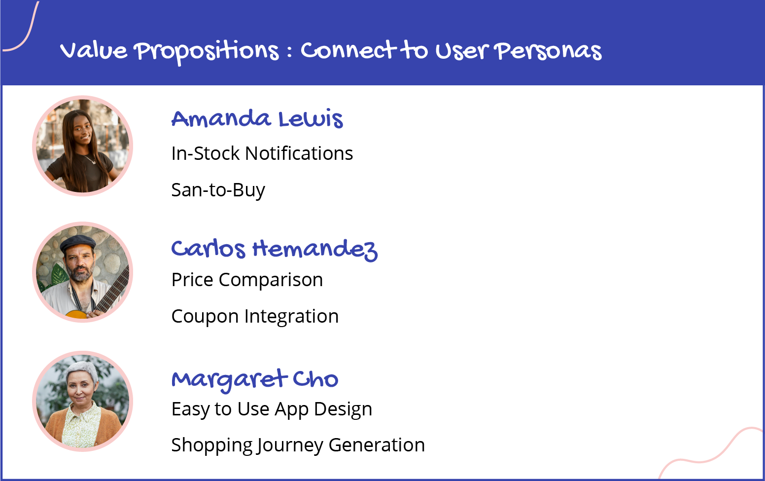
To begin the user research, I developed three detailed user personas—Amanda, Carlos, and Margaret—each representing different grocery shopping behaviors and challenges. I used user empathy maps, stories, and journey maps to deeply understand their needs, frustrations, and goals. To validate these personas, I conducted real-life user research through a survey with 25 participants, gathering insights into their typical grocery shopping experiences and pain points. This research informed problem statements and hypothesis statements for each persona, allowing me to create solutions tailored to their specific challenges, such as time-saving features for Amanda, budget-conscious tools for Carlos, and mobility assistance for Margaret.
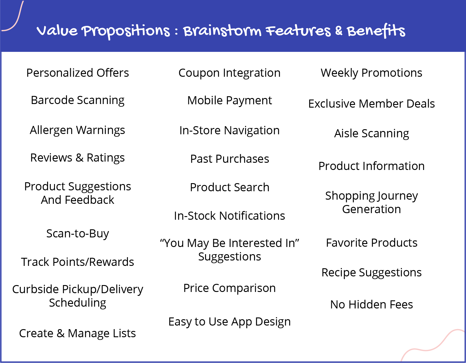
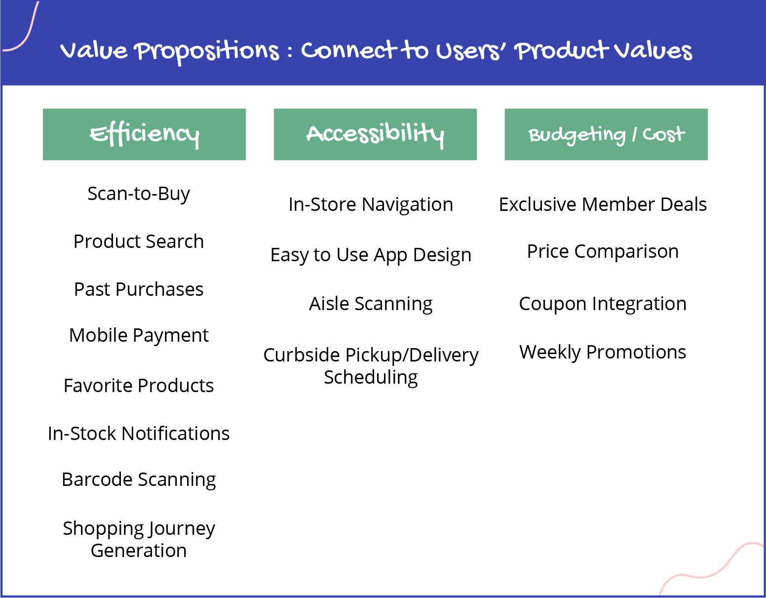
Value Propositions
To determine the application's value, I began by brainstorming potential benefits, focusing on features that would provide meaningful solutions to users. I then narrowed these ideas by aligning them with the primary goals of my three personas—saving time for Amanda, helping Carlos shop within his budget, and providing easier navigation for Margaret. After sorting through the list, I chose two key values for each persona: in-stock notification and scan-to-buy for Amanda, price comparison and coupon integration for Carlos, and easy to use app design and shopping journey generation for Margaret. These values became the foundation for the app's core features, ensuring that it directly addressed the needs of each user.
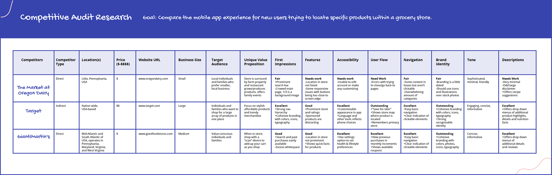
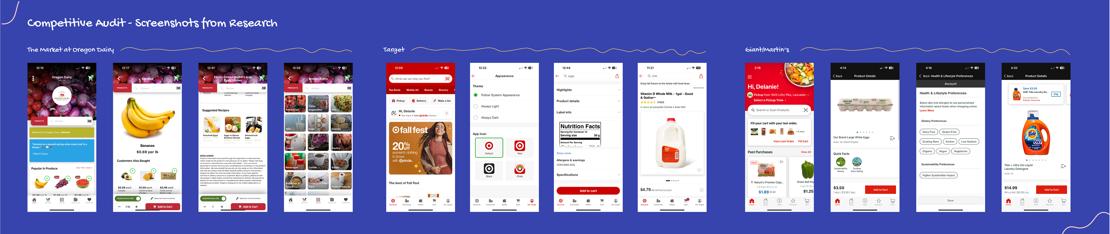
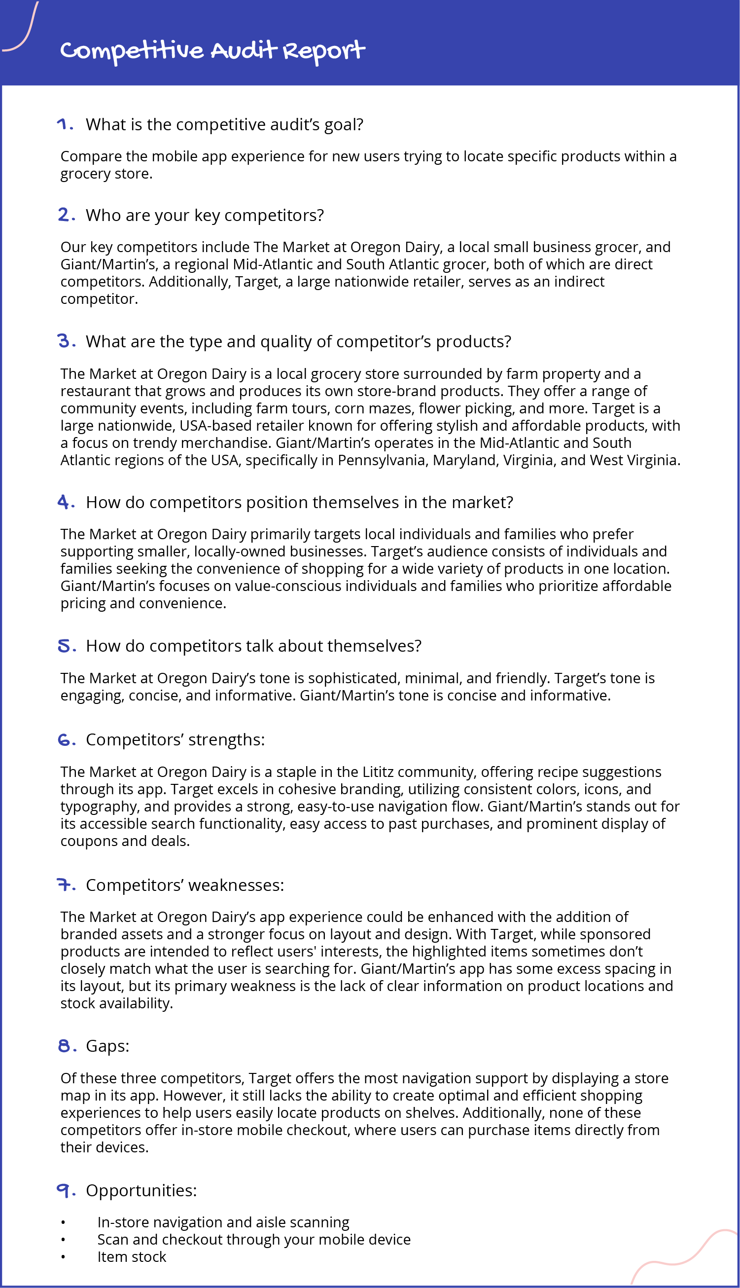
Competitive Audit
In my competitive audit, I researched two direct and one indirect competitor: The Market at Oregon Dairy, Target, and Giant/Martin's. I analyzed each competitor's navigation features, user interface, and app functionality.
Target stands out for its store map feature, but it often struggles to provide a seamless shopping experience, as sponsored products may not align with user needs. The Market at Oregon Dairy offers a community-focused approach but lacks robust navigational tools. Meanwhile, Giant/Martin's has a user-friendly layout but fails to highlight product locations effectively. This research will inform the app's development, ensuring it delivers a solution that enhances the speed and ease of grocery shopping
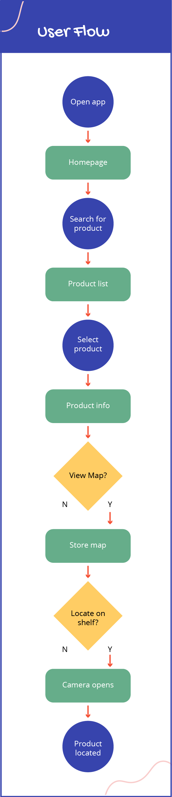
User Flow
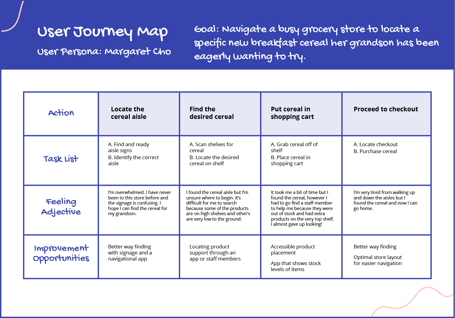
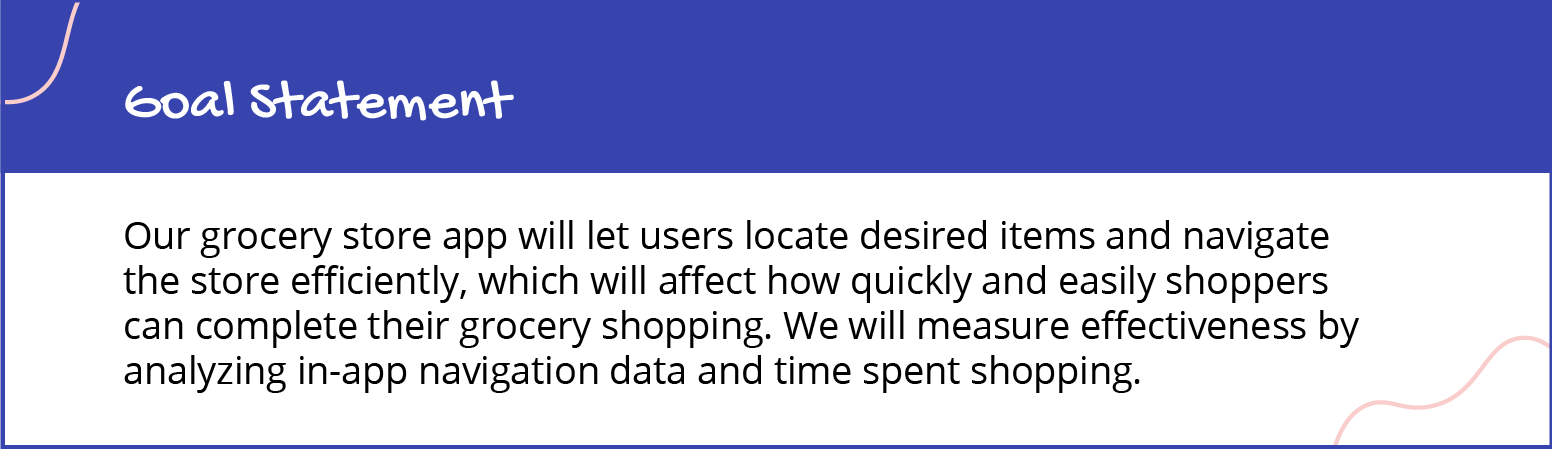
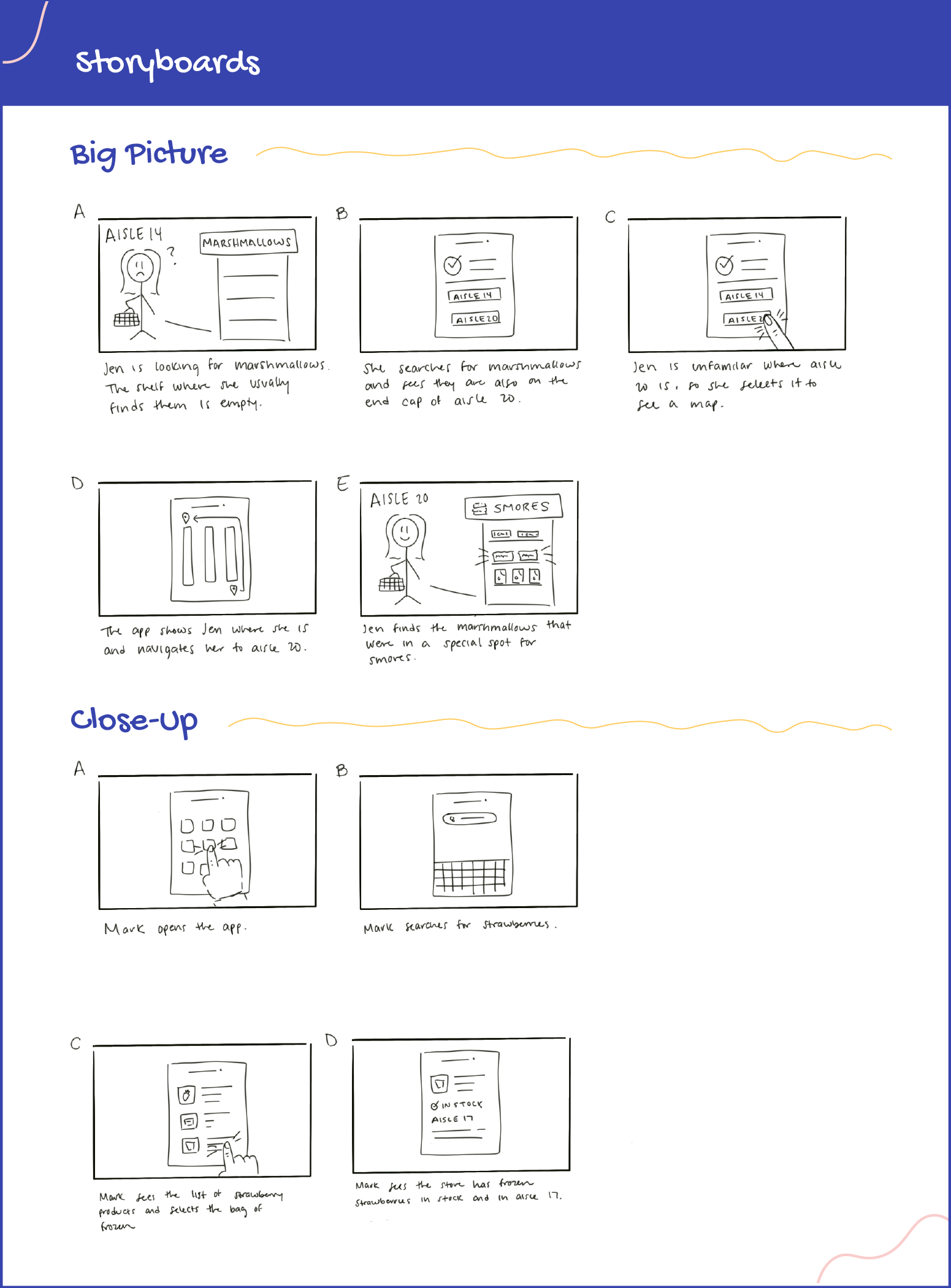
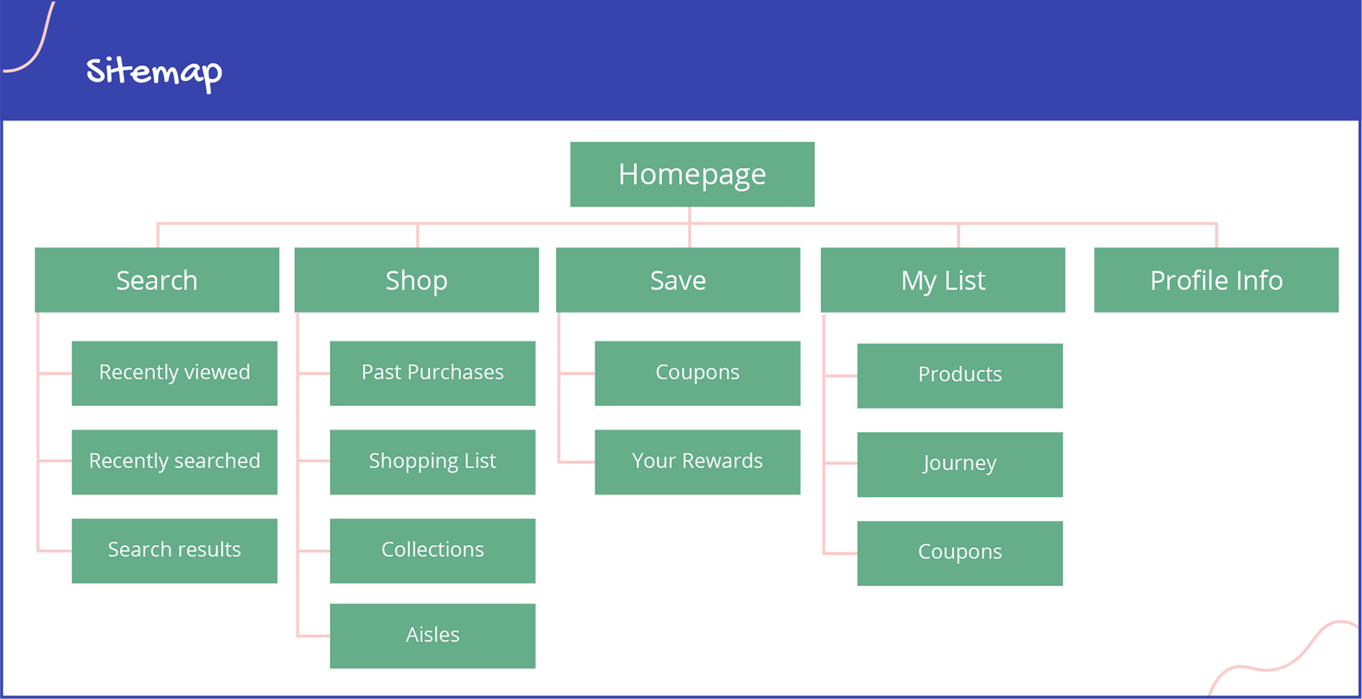
To create a seamless user experience, I began by developing a user flow that mapped out the steps a user would take to locate an unfamiliar product in the grocery store. This helped visualize the most intuitive path from start to finish. I then created both a big-picture storyboard to illustrate a user finding a product that is in stock in another part of the store and a close-up storyboard to show a specific interaction of searching for an item. Additionally, I built a site map, organizing the app’s structure to ensure easy navigation and logical groupings of features.
Wireframes & Low-Fidelity Prototype
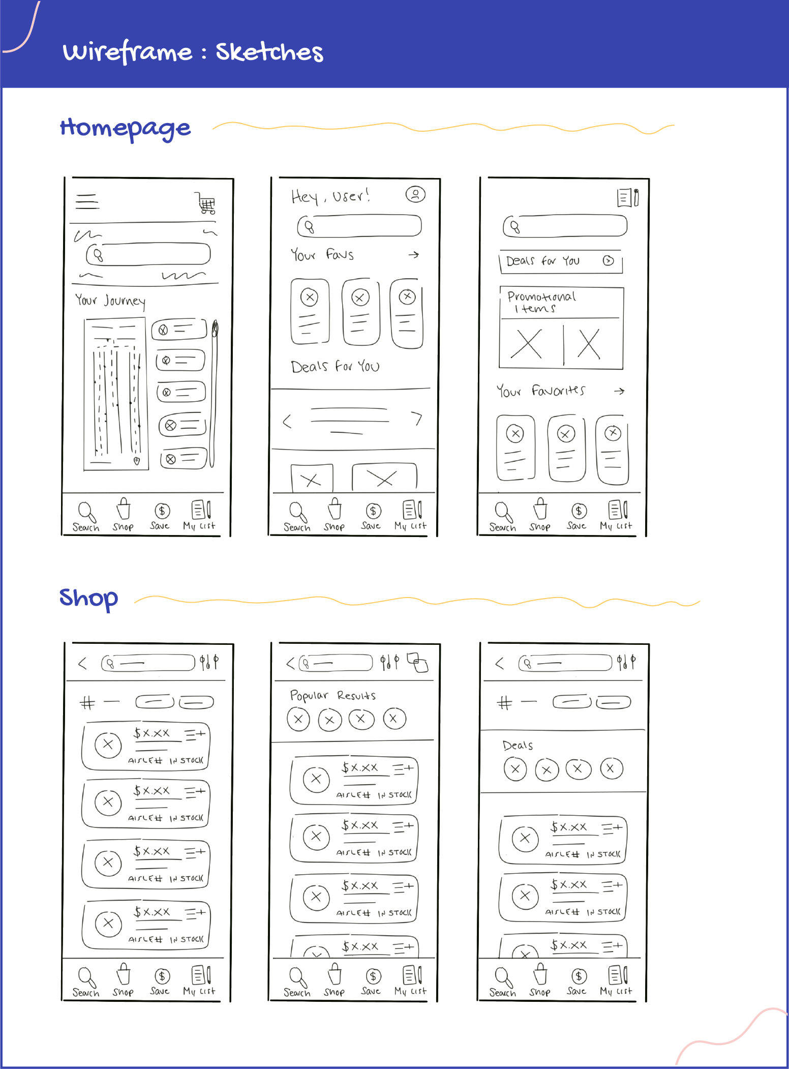
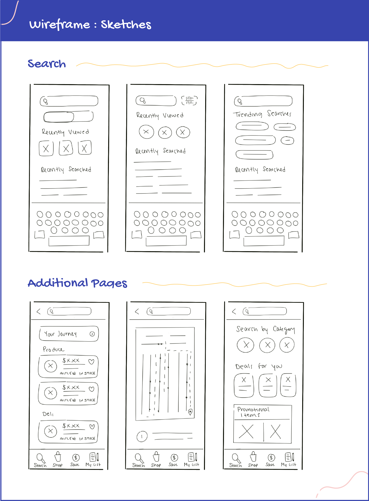
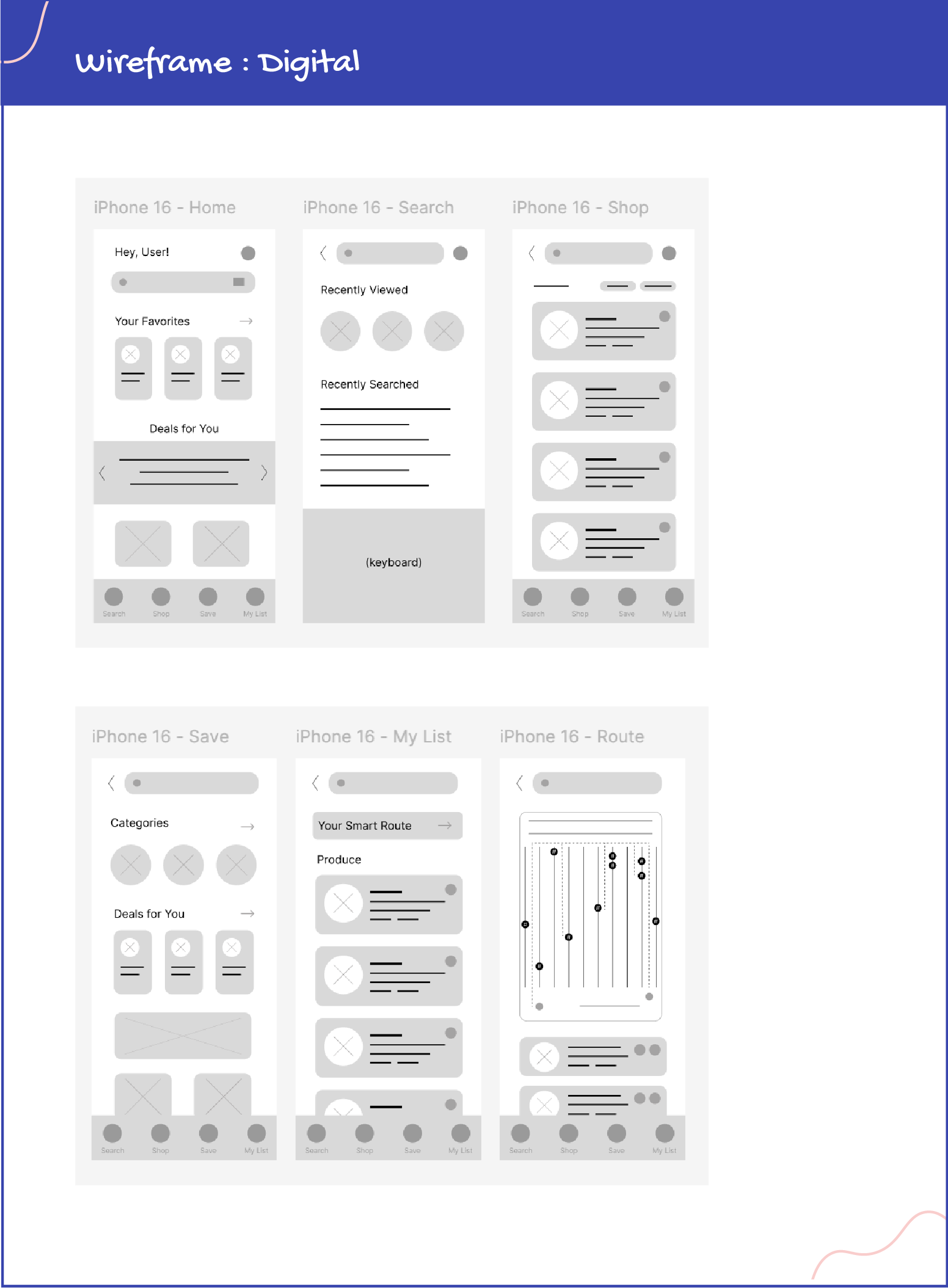
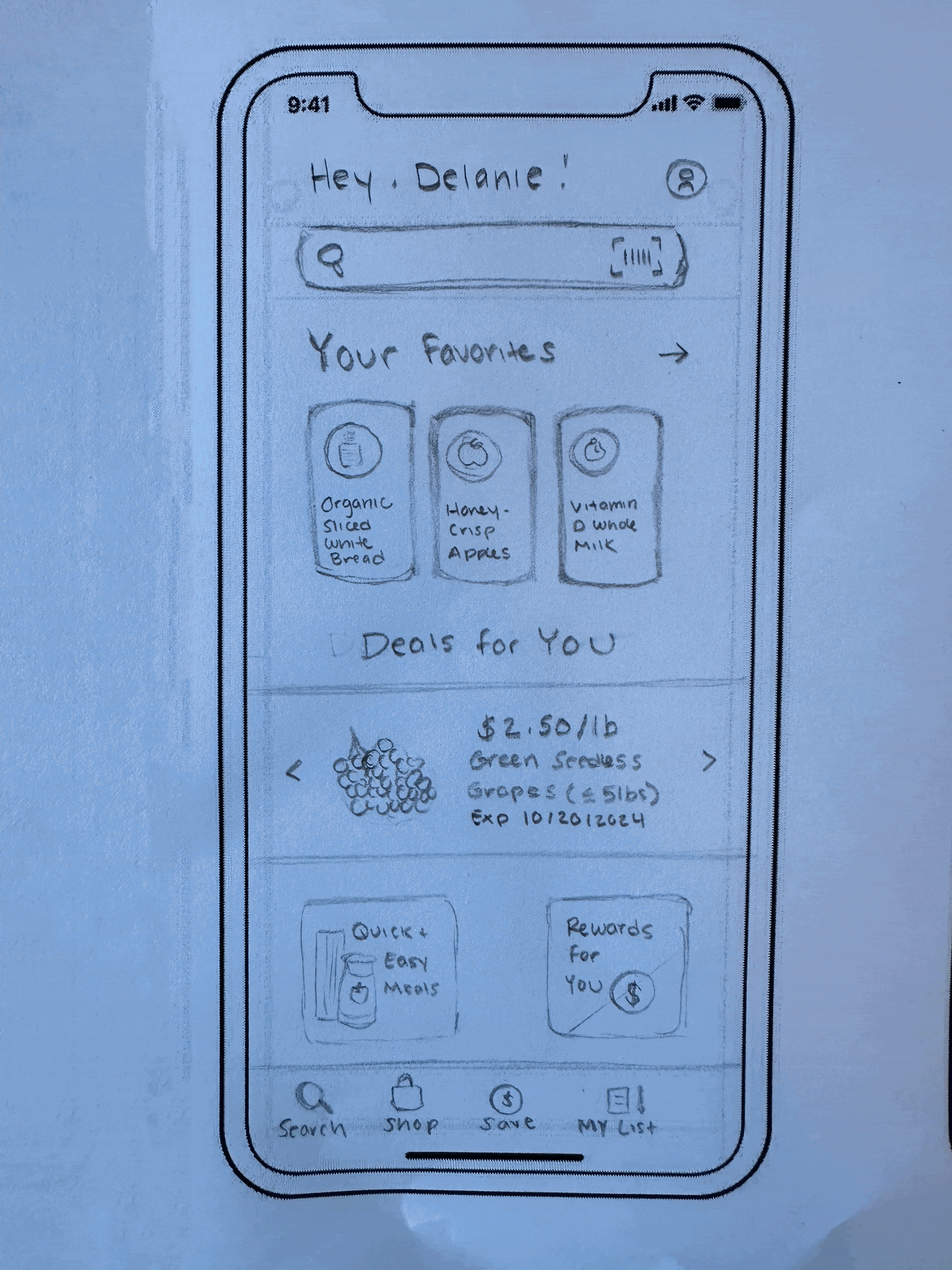
Transitioning to the design process, I started by developing wireframe sketches to outline the app's structure and layout, prioritizing functionality and user flow. These sketches served as the foundation for my paper prototypes, where I demonstrated the flow of adding a product to the user's shopping list and then locating the product on their shopping route.
After the paper prototype, I moved to Figma and created a low-fidelity digital prototype using my digital wireframes.
Testing Early Concepts
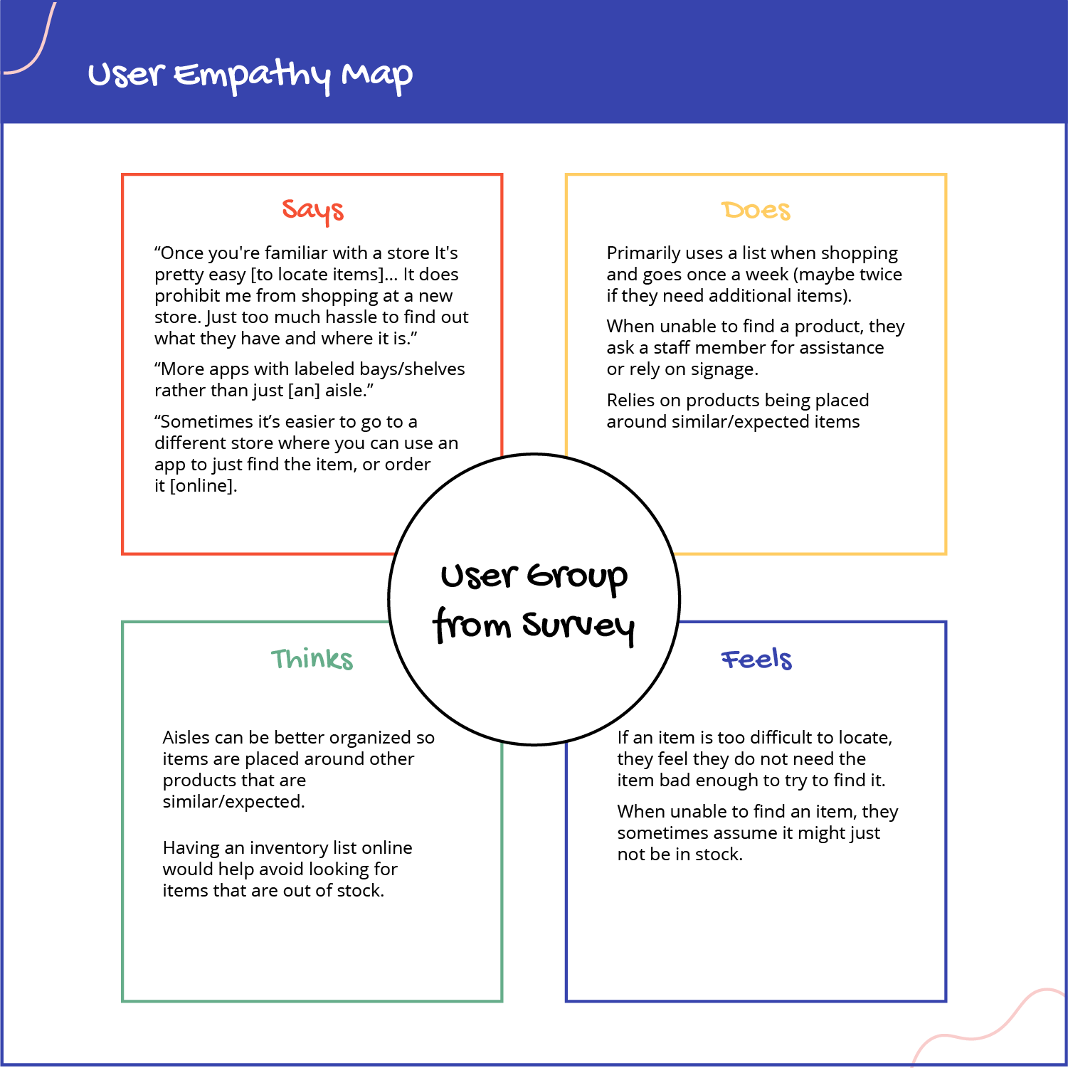
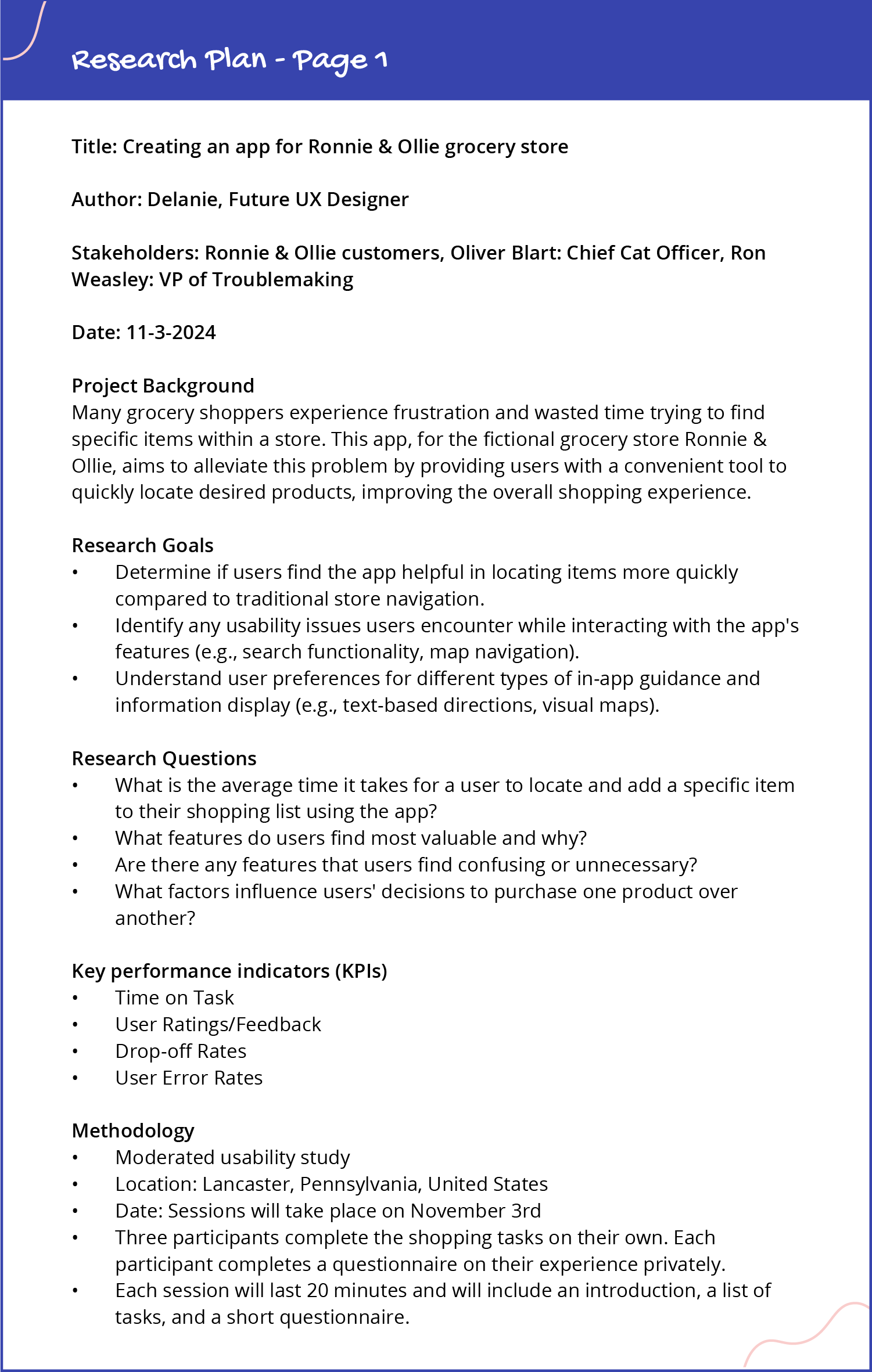
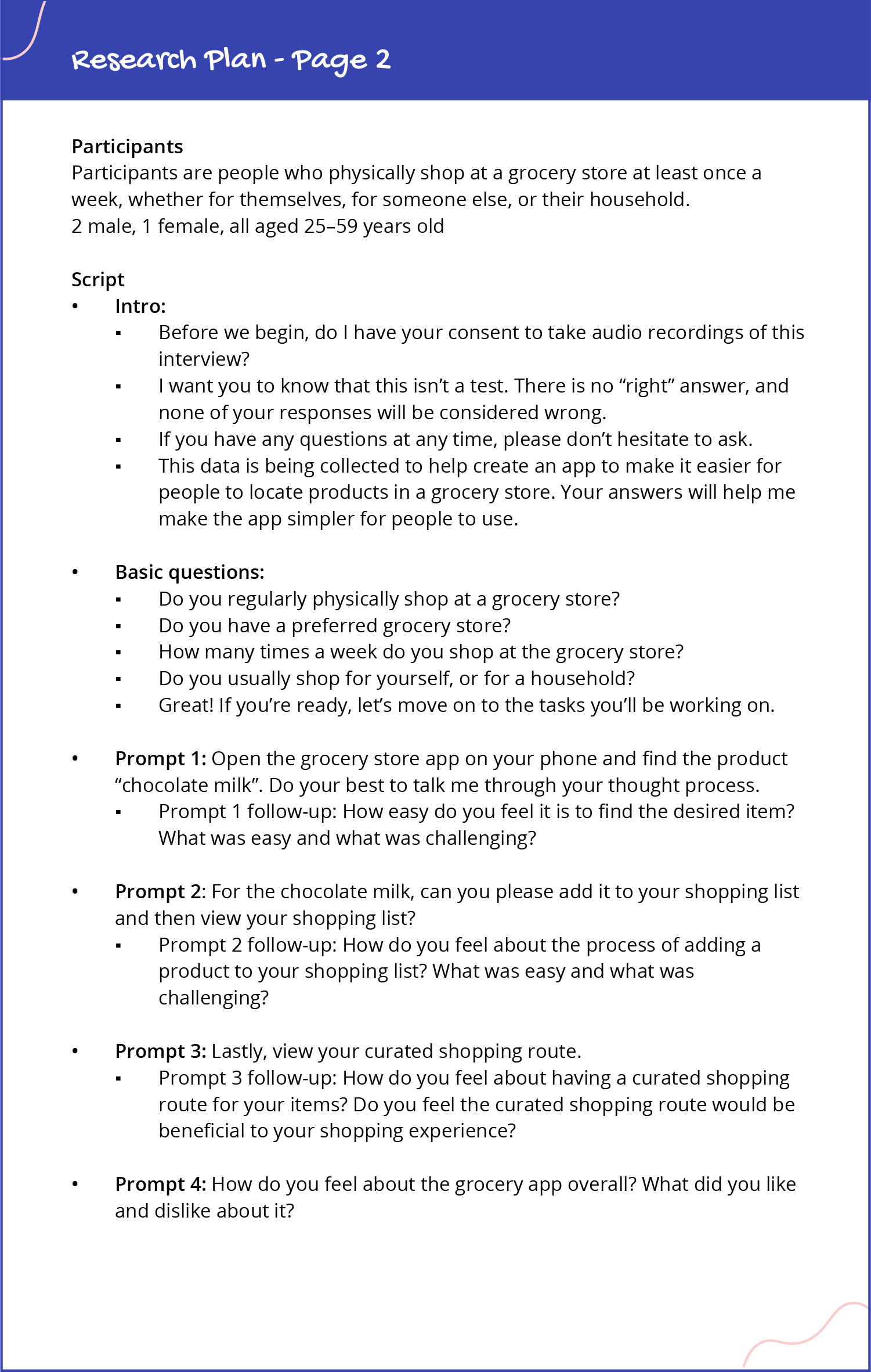
After completing the initial prototype, I conducted usability research to enhance the user experience and ensure intuitive navigation. I started by creating a detailed research plan with clear objectives and key questions to steer the process. I then interviewed target users in a moderated study taking notes and gathering insights into their shopping habits and preferences, and observed them completing tasks within the app as I moderated the study.
View the Google Sheets file
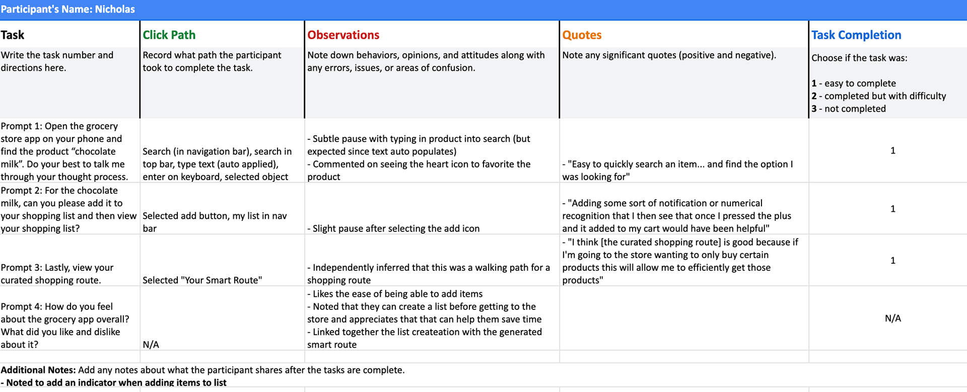
Notes on Participant A
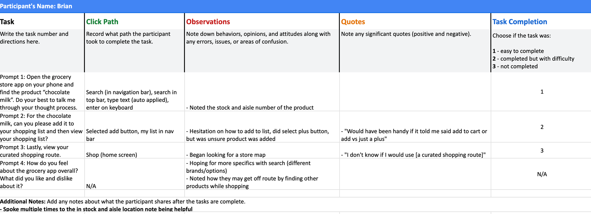
Notes on Participant B
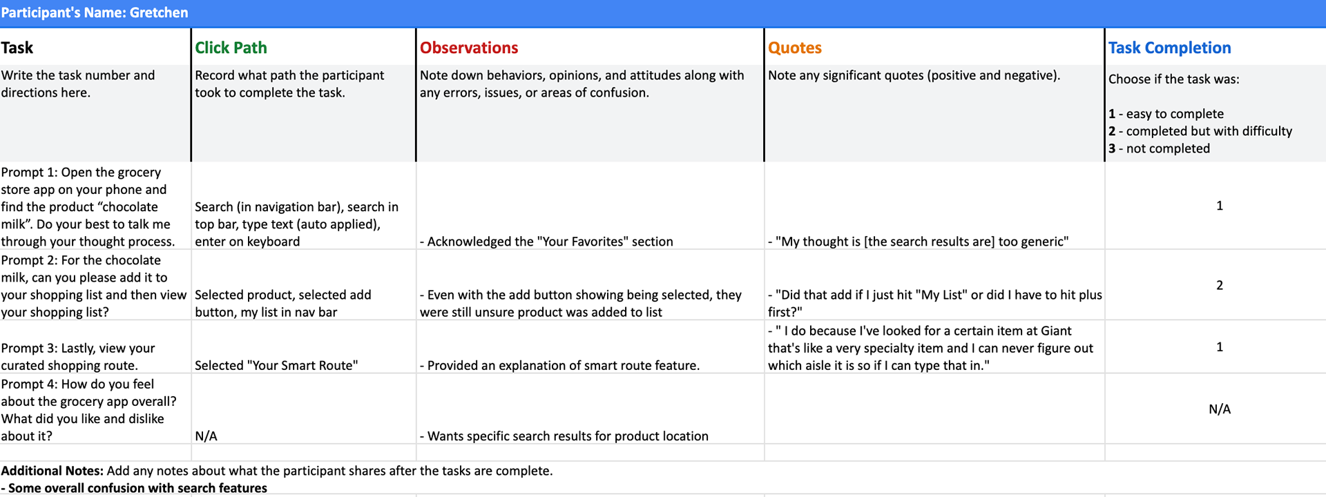
Notes on Participant C
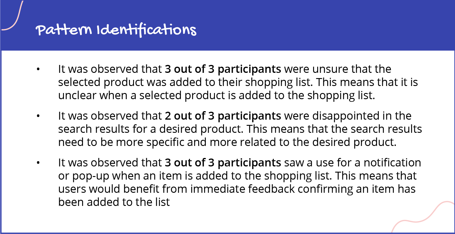
Using an affinity diagram, I consolidated the data from these sessions and identified trends and common pain points. Using the grouped themes, I wrote three pattern identifications based off of the observations.
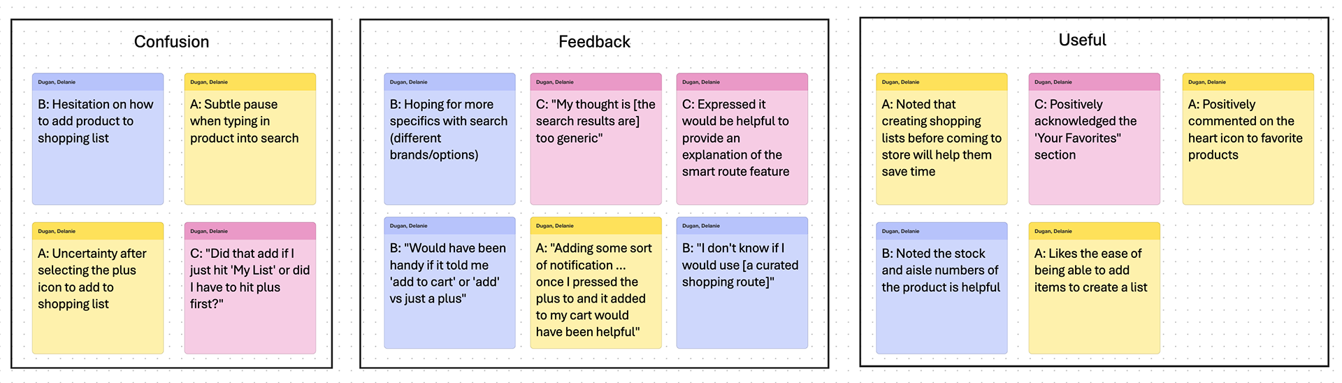
Affinity Diagram
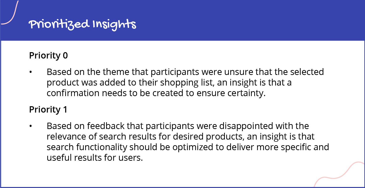
To present my findings I created a presentation to share with a hypothetical design team and stakeholders. This presentation then lead to prioritizing the insights into what needs to be taken action on in order of importance.
View the Google Slides file
High-Fidelity Prototype
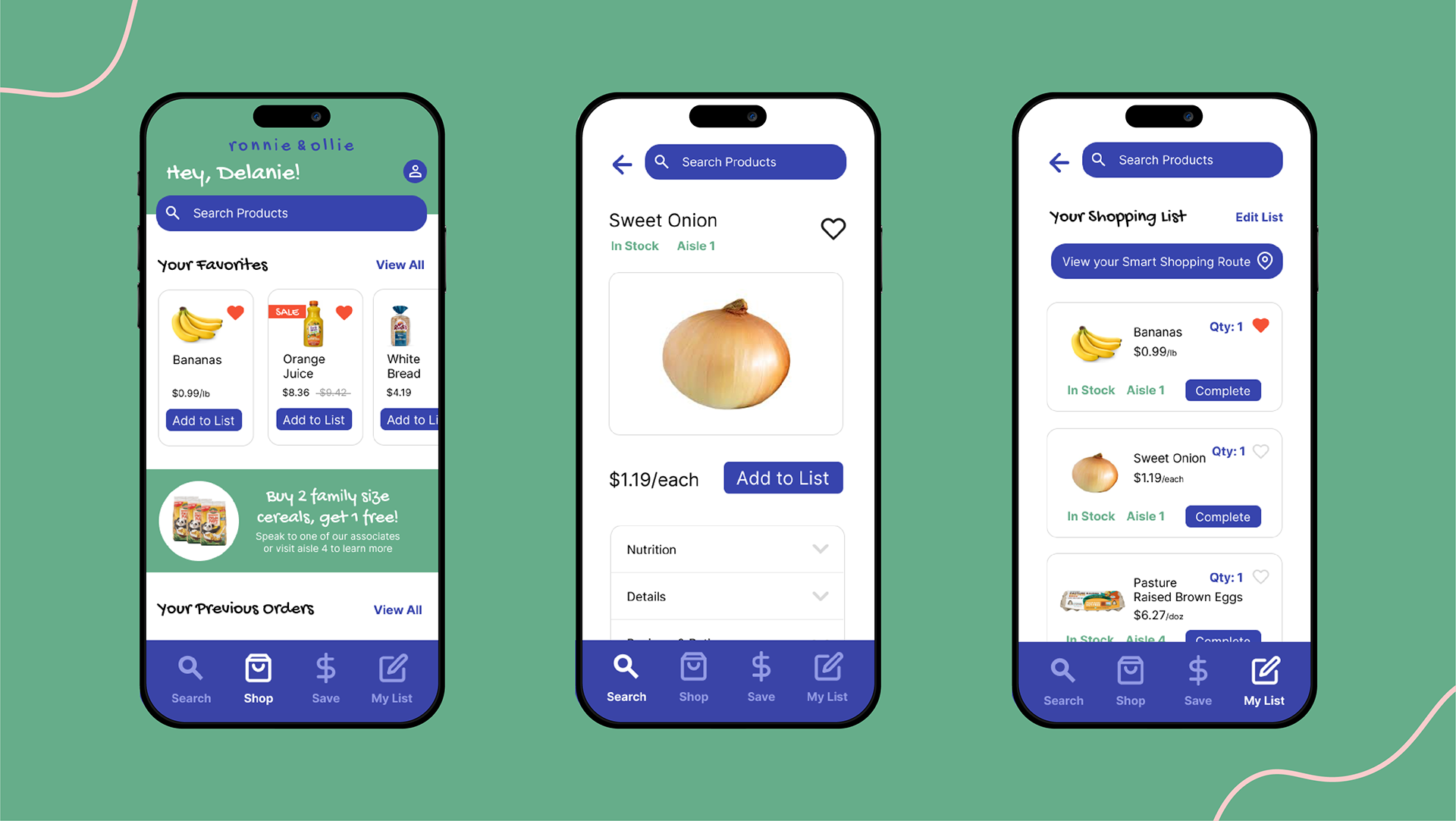
In refining my prototype into a high-fidelity version, I focused on enhancing both design details and functionality. Using Figma, I evolved my skills by creating reusable components for consistent design elements, streamlining updates across the project. I also deepened my knowledge of Figma’s interactive features, incorporating transitions and interactions to simulate the user experience.
The prototype illustrates the flow of searching for the product "sweet onion", adding it to a shopping list, and viewing a smart shopping route tailored to the list.
If you're on mobile, you can interact with the prototype in your browser using Figma.

User Interfaces for Web
The next phase of the certificate program focused on designing dynamic user interfaces for websites. I revisited a college project for an app called Switch Hands and evolved it into a website where parents can shop and sell gently owned children's items and clothes.
To bring the brand to life, I developed Switch Hands identity with a focus on childhood-inspired colors and playful shape elements, I also added a moving marquee to make the interface more engaging and dynamic.
During this project, I concentrated on mastering tools in Figma and understanding how to incorporate interactive elements effectively into the user experience.
If you're viewing on mobile, check out the screen recording of the prototype in the video below.

Design for Social Good
As part of the final project for my certificate program, I developed a mobile app and website designed to promote a positive social good. I chose to create a color contrast checker focused on accessibility in design. This tool allows users to upload their designs, automatically flagging contrast errors and providing recommendations for improvement. The contrast-checking logic is based on WebAIM’s Contrast Checker, a widely used resource for evaluating text and background color ratios against accessibility standards.
Through my time at Deloitte, I have been learning about Section 508 Compliance, which ensures digital accessibility for people with disabilities, particularly in government and federally funded projects. In my client work, I regularly use WebAIM to assess accessibility, but I have identified areas where the tool could be enhanced to better meet my team's needs. My project builds upon these insights, introducing improvements that create a more user-friendly and comprehensive solution tailored to real-world design challenges
Software Used
Figma, Adobe Illustrator, Google Docs, Google Sheets & Google Slides